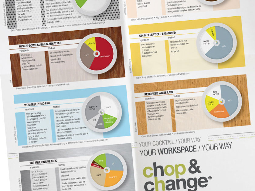

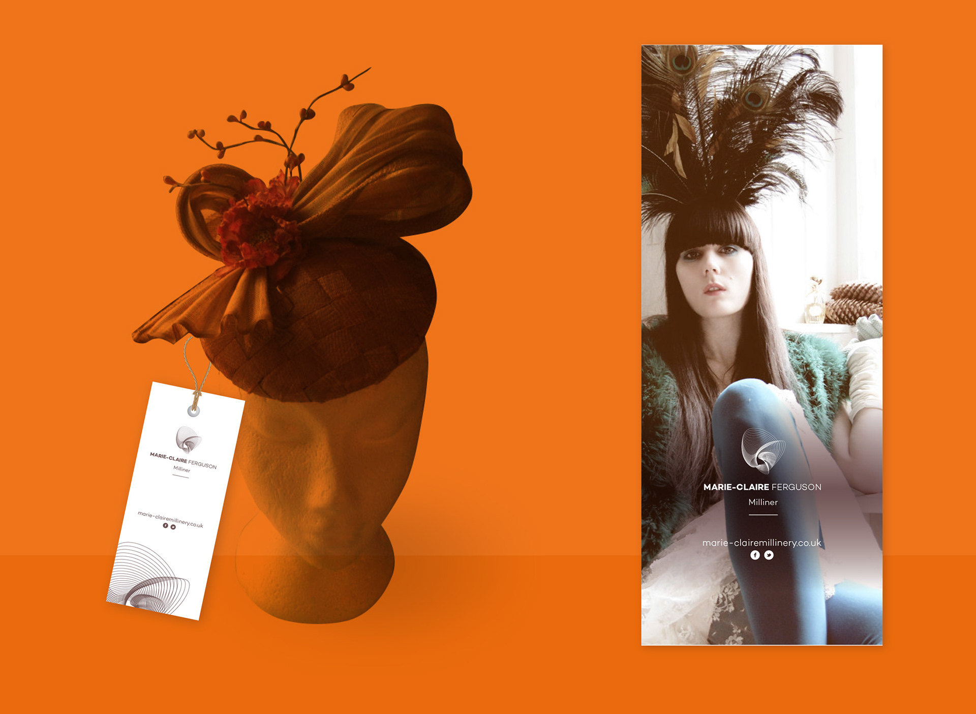
Marie Claire Ferguson commissioned me to produce an identity for her milliner business.
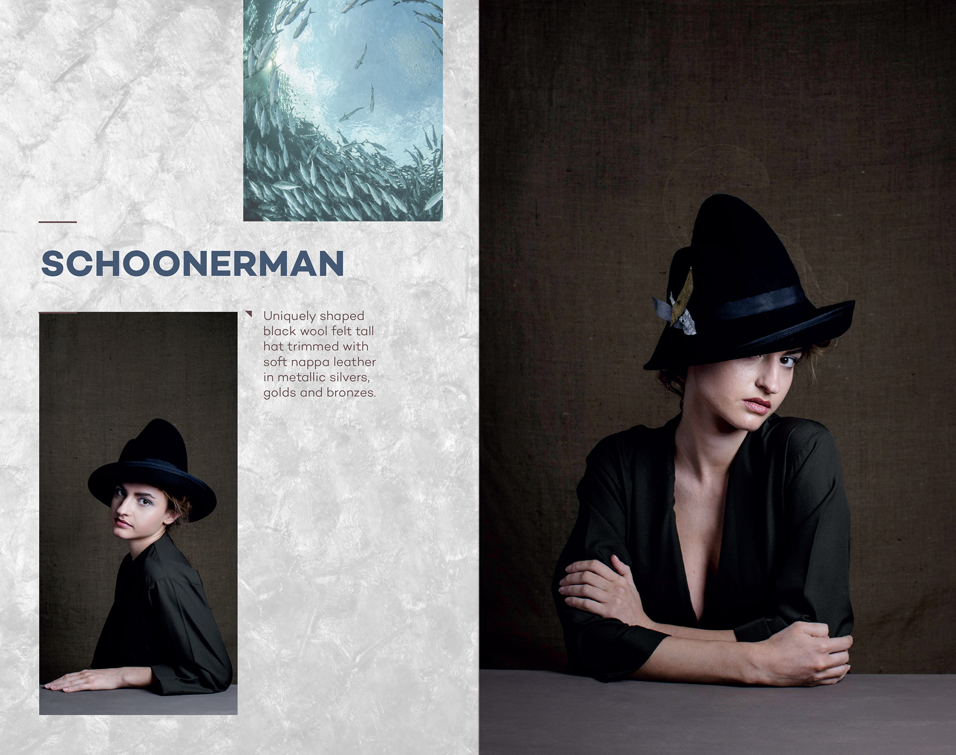
Her designs range from gravity defying sculptural creations to ethereal and whimsical headpieces. She enjoys juxtaposing traditional millinery styles with contemporary design.
The brief requested that we add professionalism to an already thriving business. She was stepping up production and wanted to take her business to the next level. Releasing collections on a bi-monthly basis, she now needed an emblem to truly represent her talent and ambition and to compete on a more international stage.
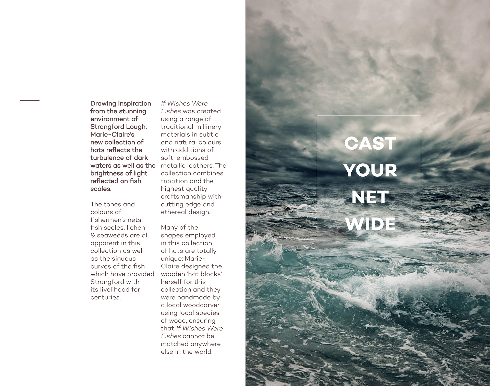
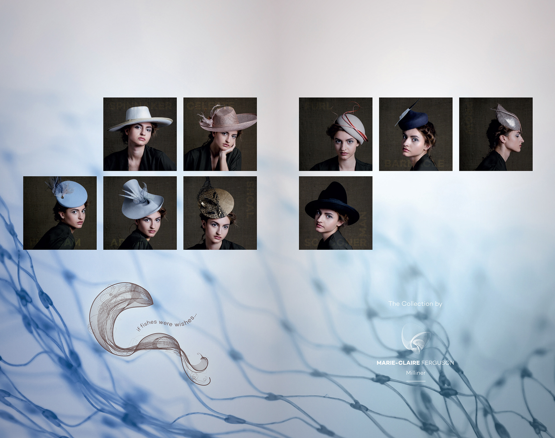
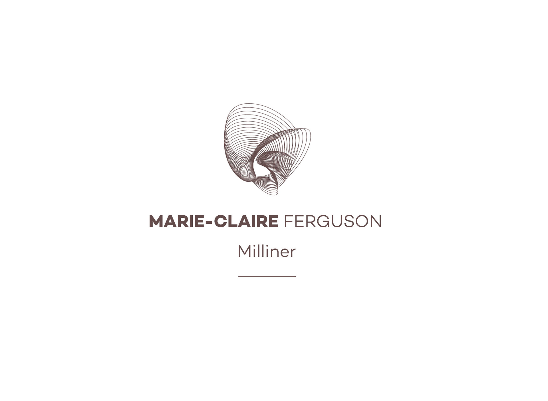
We settled on a bespoke marque, a flowing structure that nods to the unique environment of her workshop, overlooking Strangford Lough. The sea aspect features heavily in her work so it was only fitting the marque would have connotations of aquamarine life also.
The main free flowing structure also plays into some of the structures of her headpieces. This was coupled with a clean, contemporary sans serif font, to provide impact.
A monochrome sepia brown shade on white was chosen for the palette to provide contrast to her fantastic creations.
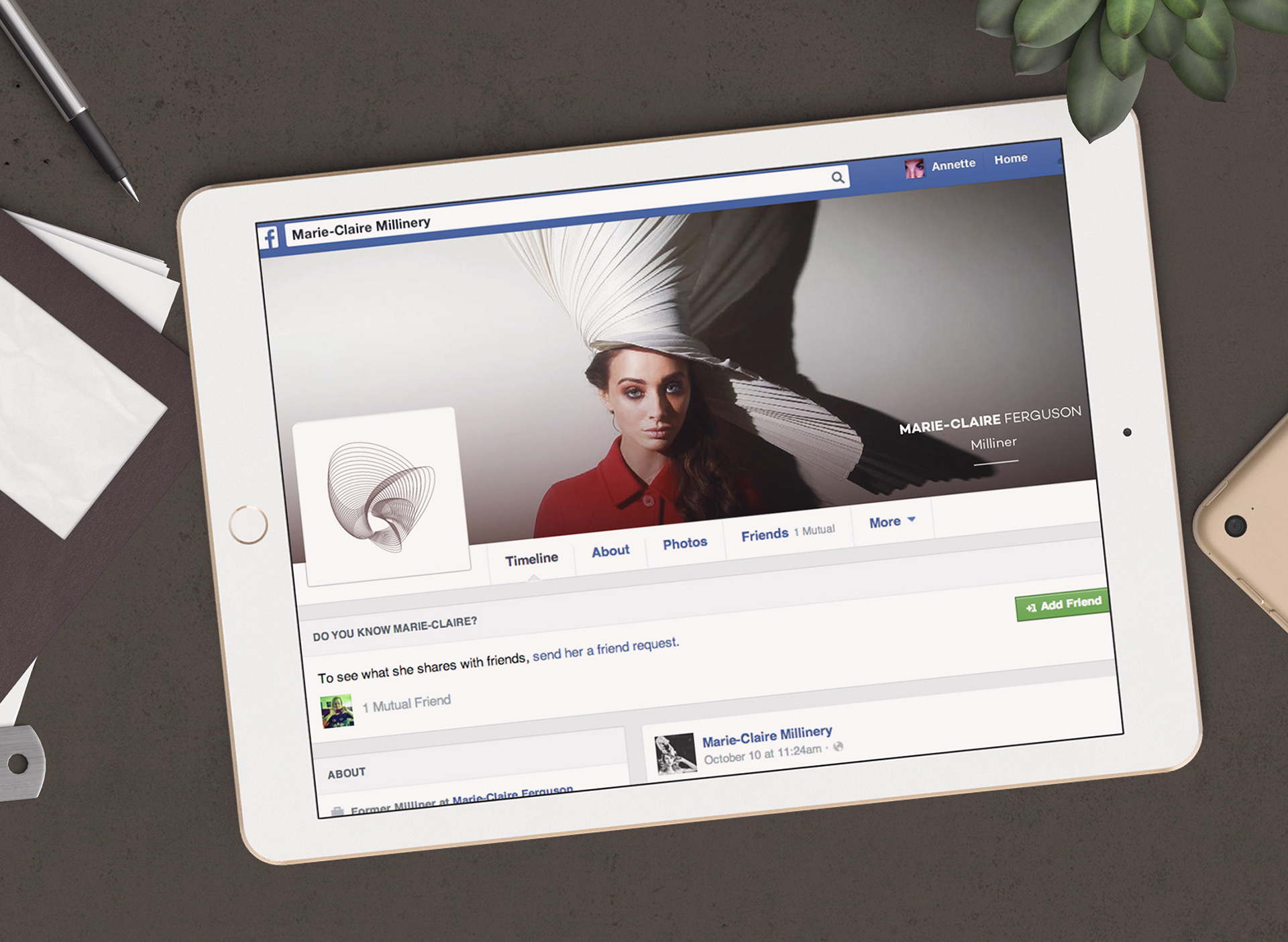
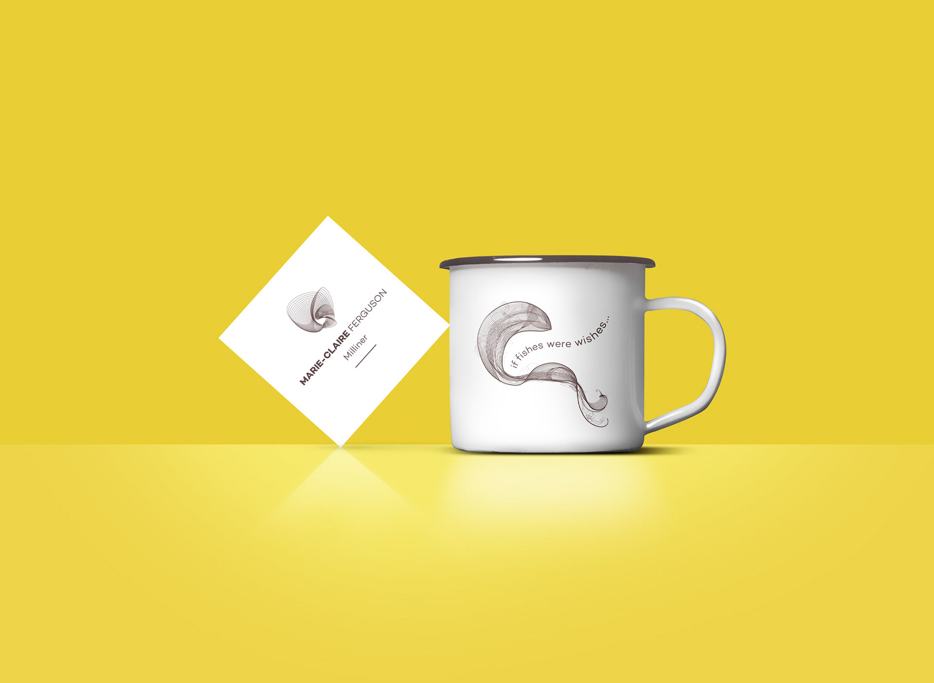
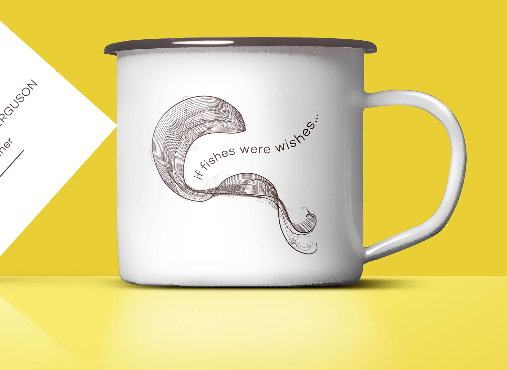
The brand was applied across all collateral from hat boxes to the digital space and everywhere in between. A collection identity was also created for the 'If fishes were wishes' collection, by means of a promotional lookbook released to potential stockists.
The main free flowing structure also plays into some of the structures of her headpieces. This was coupled with a clean, contemporary sans serif font, to provide impact.
A monochrome sepia brown shade on white was chosen for the palette to provide contrast to her fantastic creations.
The brand was applied across all collateral from hat boxes to the digital space and everywhere in between. A collection identity was also created for the 'If fishes were wishes' collection, by means of a promotional lookbook released to potential stockists.